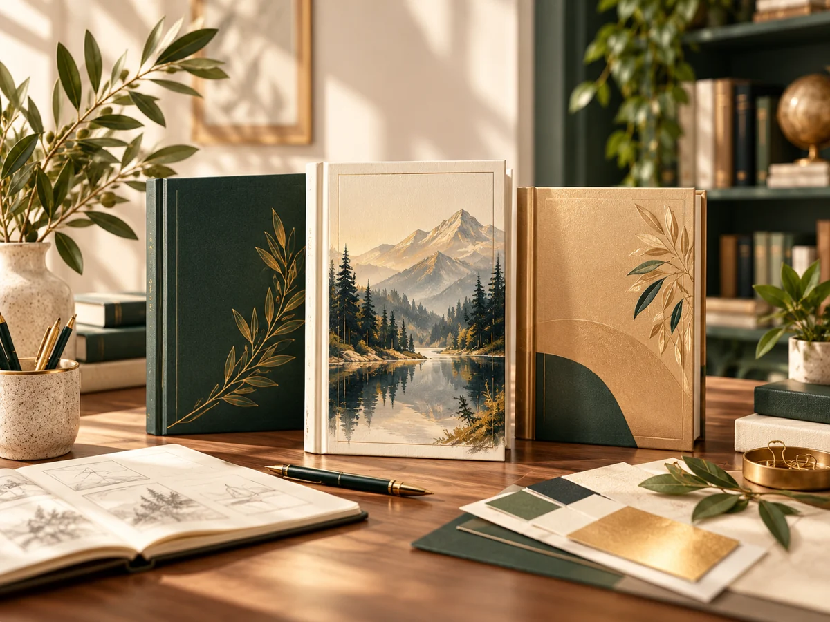
A cover needs to communicate the book’s identity and suit its production format. Beginning with a brief makes the creative process more focused. Before choosing an image or typeface, define the intended reader, the genre, the tone, and the practical files the project must deliver.
Define the reading experience
Summarize what the book offers and how it should feel to a reader. A concise synopsis, audience description, and a few carefully chosen comparable titles can help. Explain what you notice in reference covers rather than asking the designer to reproduce them.
Give the design one clear direction
Trying to represent every character, location, and theme can make a cover crowded. Select the strongest visual idea and let hierarchy support it. The title, author name, and imagery should be understandable when the design is reduced for an online listing.
Plan the typography and the image together
A good image does not solve a poorly arranged title. Consider contrast, placement, spacing, and how type relates to the visual concept. Avoid choosing artwork first and treating the title as an afterthought that must fit whatever space remains.
Confirm specifications and permissions
The print version needs details such as trim size, final page count, and the selected provider’s template. Images and fonts also need appropriate usage permissions. Identify source files and intended additional uses before final artwork is approved.
Review both the creative idea and the final details
Check whether the cover communicates the right genre and tone, then separately proof the title, author credit, back-cover copy, and production information. View the design at thumbnail size and inspect a physical proof where appropriate.
Put It Into Practice
Write a one-page brief with five headings: reader, genre, mood, required information, and final formats. Keep the brief focused on decisions the design must solve.